Difference between revisions of "Announcement:A New Look..."
m (Kradorex Xeron moved page Announcement:New Look to Announcement:A New Look...) |
|||
| (One intermediate revision by the same user not shown) | |||
| Line 4: | Line 4: | ||
'''Full:'''<br> | '''Full:'''<br> | ||
| − | + | <html><img src='//static.digibase.ca/img/dbo-newstyle2016-full-sample.png'></html> | |
'''Slim:'''<br> | '''Slim:'''<br> | ||
| − | + | <html><img src='//static.digibase.ca/img/dbo-newstyle2016-slim-sample.png'></html> | |
'''DBO "Lock":'''<br> | '''DBO "Lock":'''<br> | ||
| Line 14: | Line 14: | ||
'''Announcement Poster:'''<br> | '''Announcement Poster:'''<br> | ||
| − | <html><a href=' | + | <html><a href='//static.digibase.ca/img/dbo-newstyle2016-poster.png'><img src='//static.digibase.ca/img/dbo-newstyle2016-poster-thumb.png'><br>(click to enlarge)</a></html> |
[[Category:Announcement]] | [[Category:Announcement]] | ||
Latest revision as of 05:11, 18 August 2018
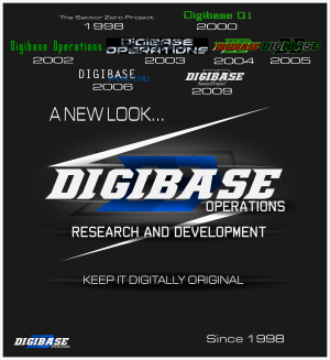
We are pleased to be announcing our transition to a new logo that preserves our historical angular style, while bringing a modern, futuristic, looking forward feel. The design is heavily influenced by a chevron arrow style that moves your eyes across the logo in a single sweep, emphasizing efficiency and progession, while maintaining a strong, striking look that can fit any application. The new design emphasizes the "Operations" text as it moves it from the bottom in a small space up to having a greater presence.
The new style has three general forms:
Full:

Slim:

DBO "Lock":
At the top left of this article.
Announcement Poster:

(click to enlarge)